Words are important, but sometimes only a picture will do. Here are the charts and graphs I come back to again and again.
Emissions and energy charts
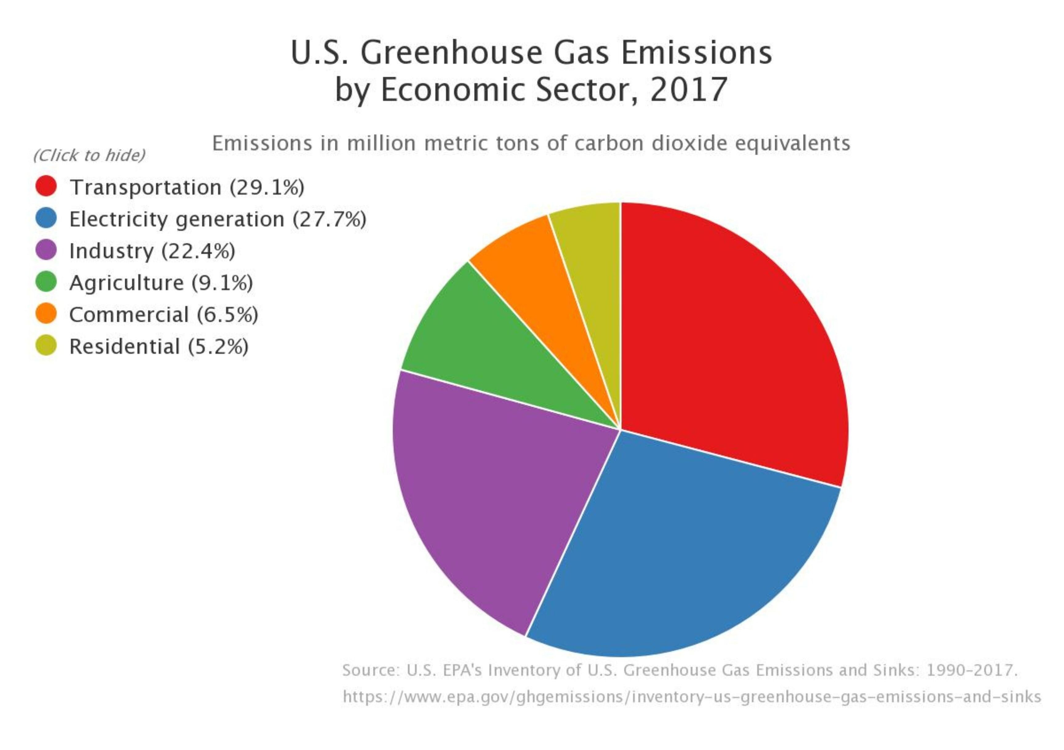
Transportation, electricity generation and industry make up 79.2% of emissions in the United States.
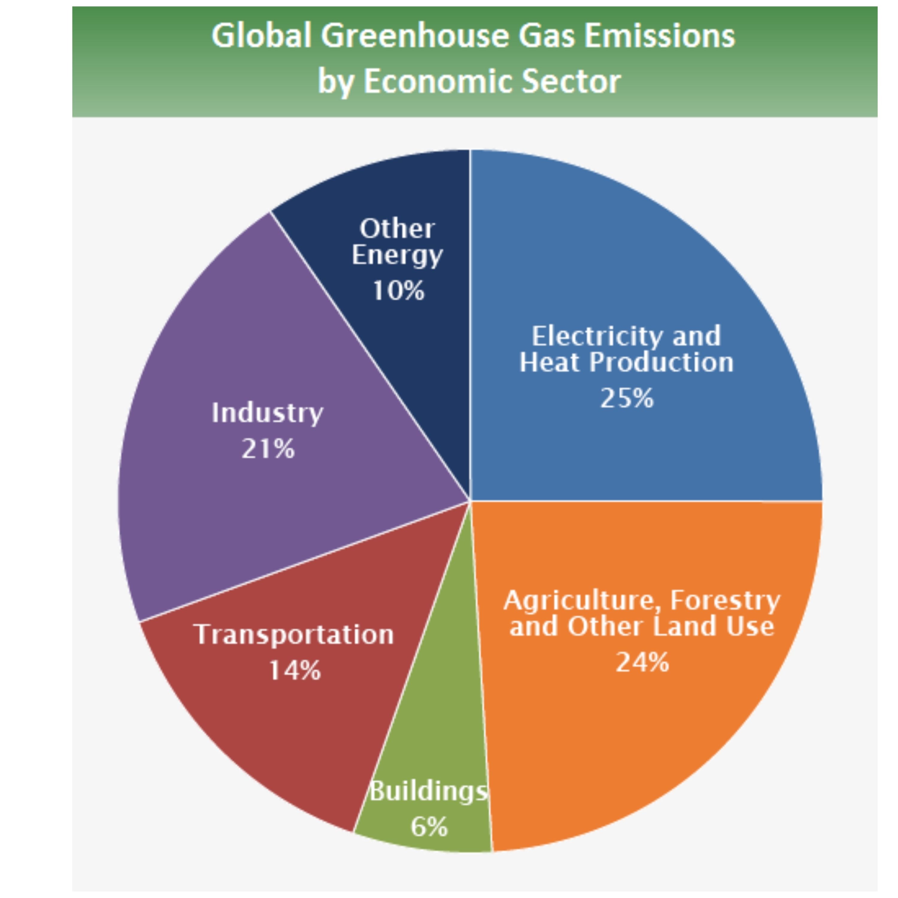
The global picture looks different.
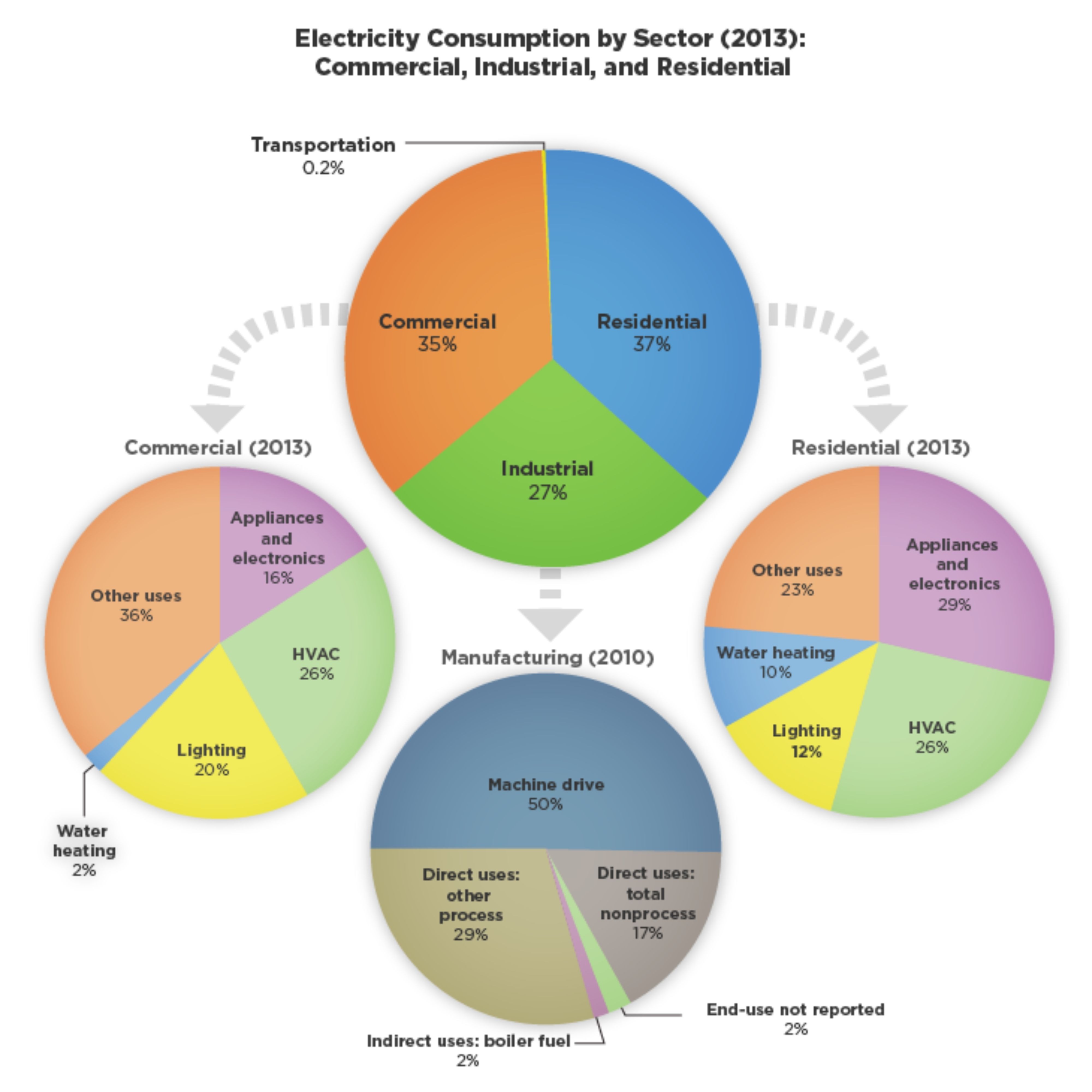
Appliances and electronics make up 29% of the electricity we use at home.
Road freight is responsible for about 6% of emissions and shipping is about 3% globally according to Drawdown.org.
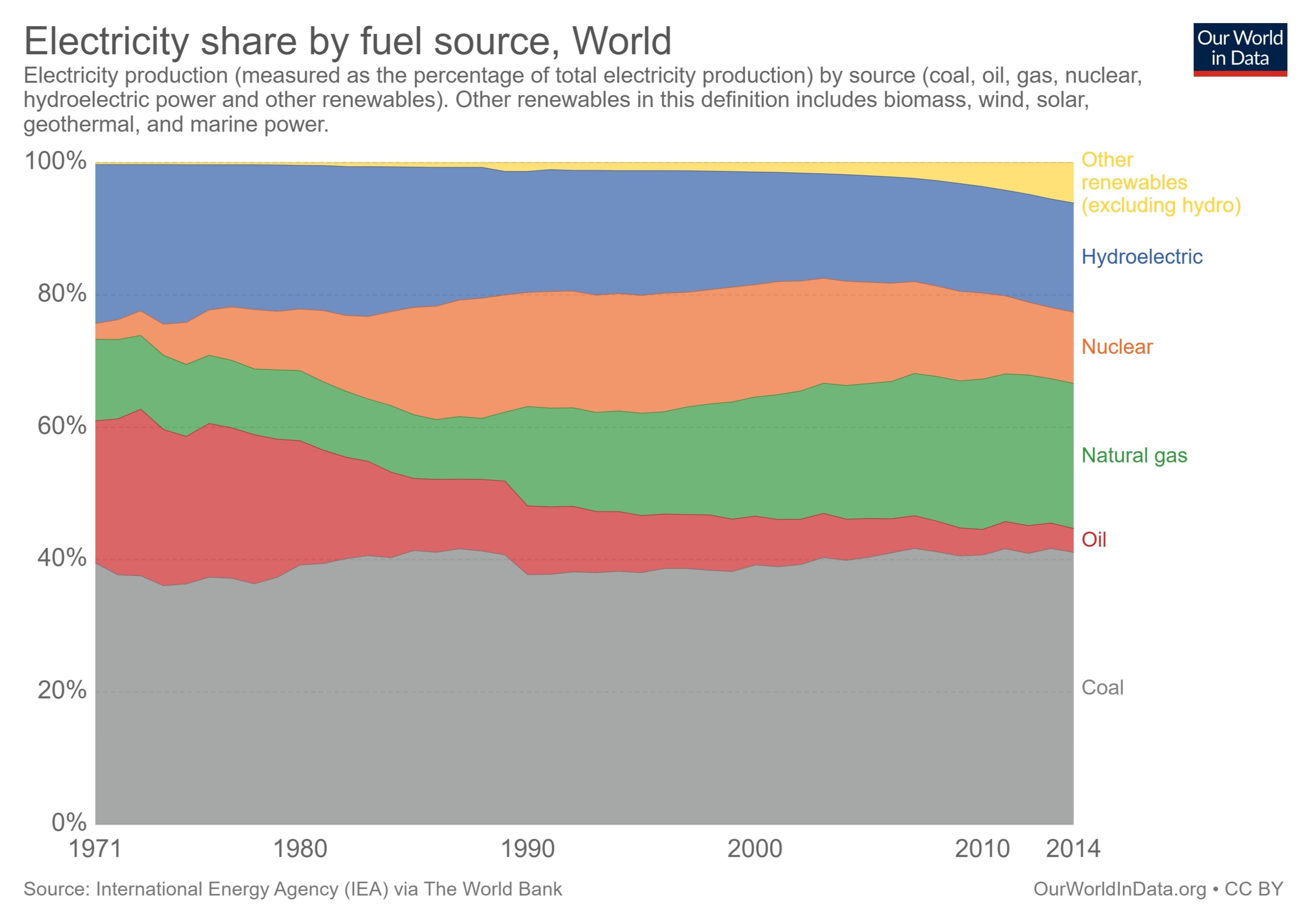
A good chunk of electricity still comes from coal globally.
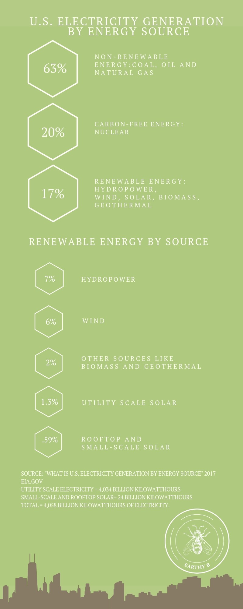
Solar power is still a very small chunk of electricity generation in the United States.
Recycling
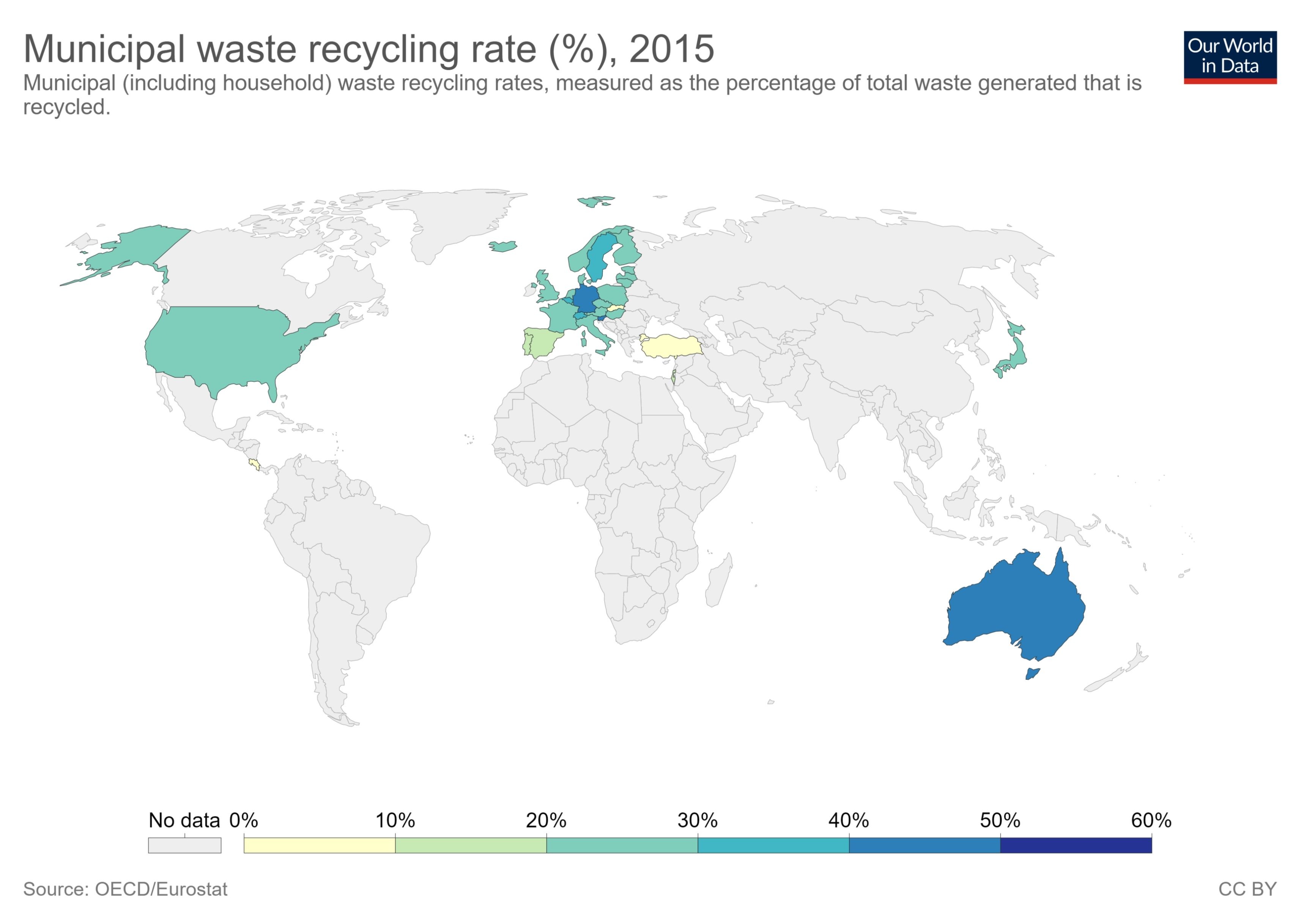
Every country needs to recycle and upcycle significantly more.
Charts about consumption
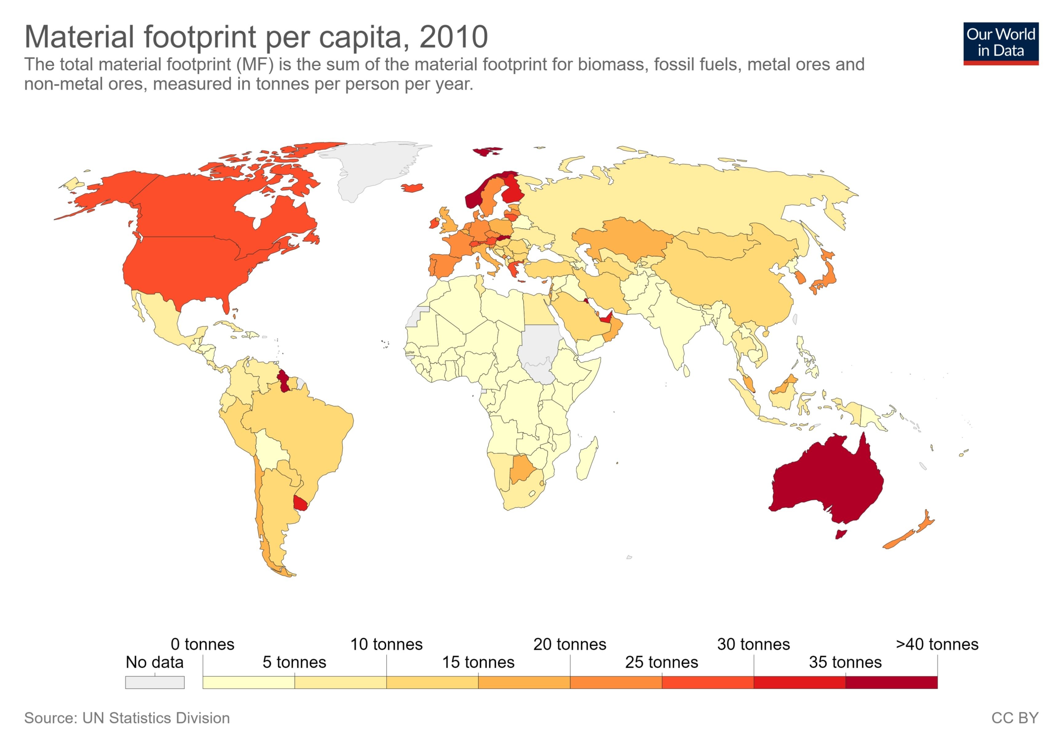
Americans buy a lot of stuff.
Climate Change
The rise of carbon dioxide
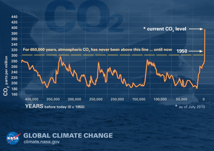
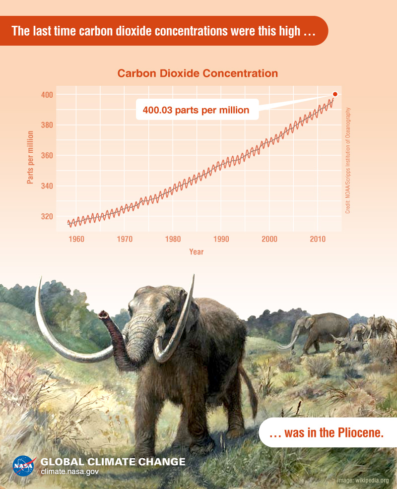
CO2 is definitely on the rise.
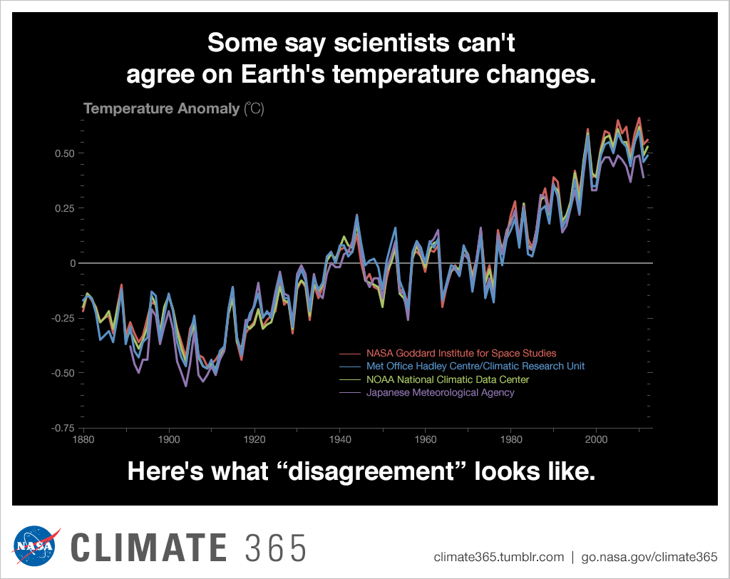
Most scientists agree climate change is real.
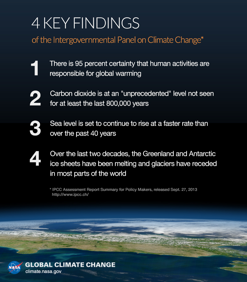
Climate change is definitely a problem.
We know we’re responsible.
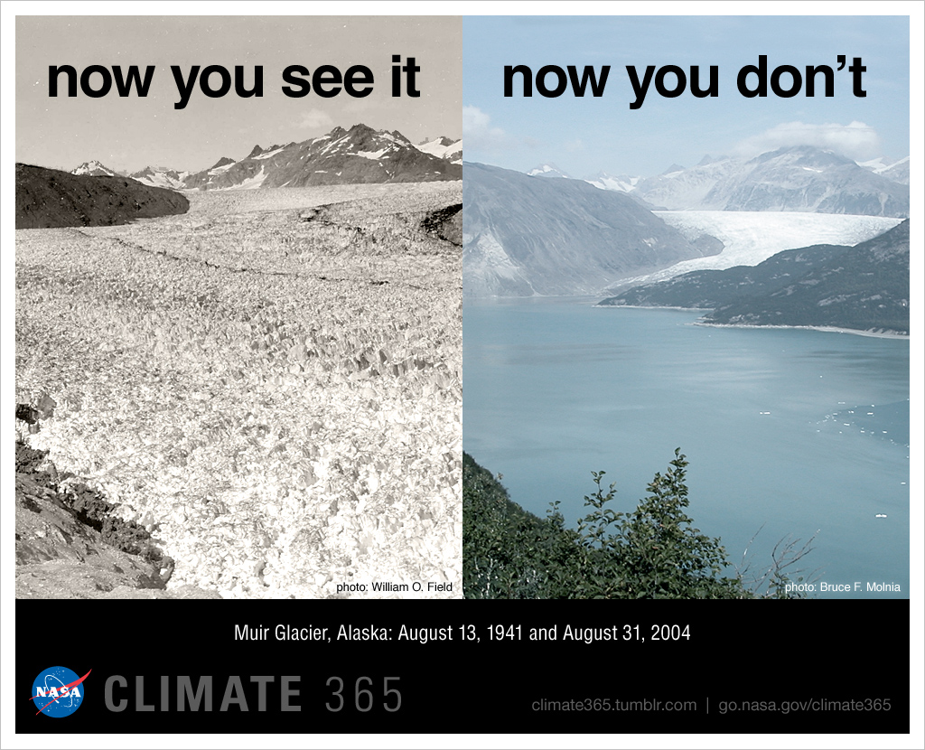
Muir Glacier 1941 vs 2004
Let’s not let the glaciers disappear.
I’m constantly finding new charts and data so I’ll keep updating this.
You may have noticed that some of this data is somewhat outdated. I do my best to find the most current data, but reliable data from sources I trust is often hard to find.
If you have data from reliable sources you think I should add, please send them my way. Leave a message in the comments and I’ll ping you back to get the link. Most comments with a link go straight to spam, so if you send a link the first time I might miss it. Thanks!